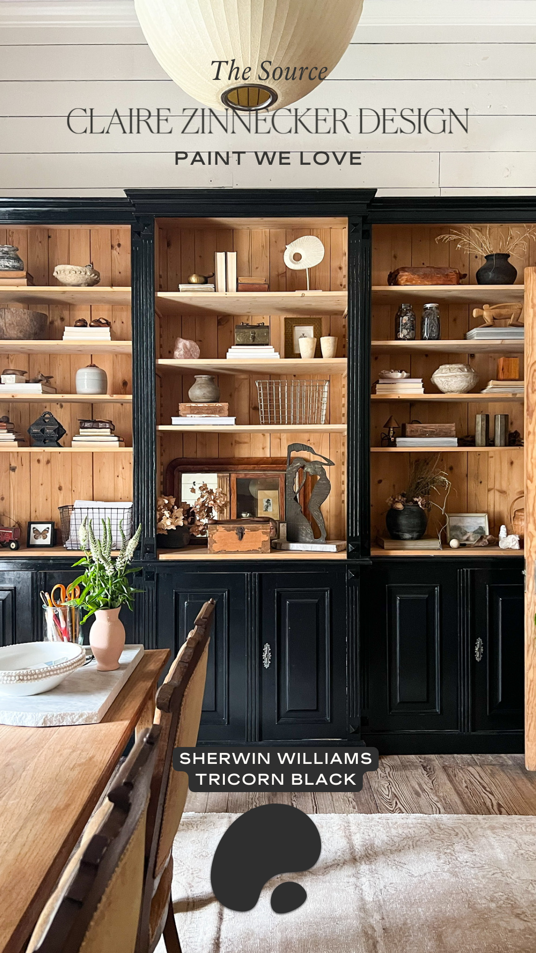
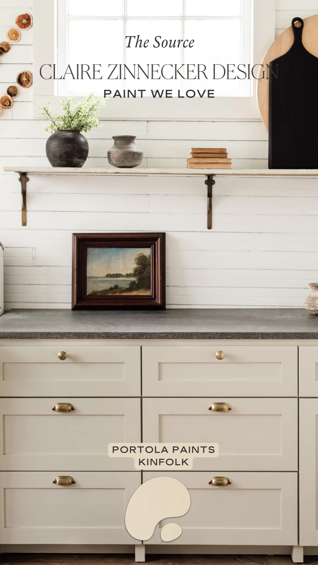
The Source: Paint We Love by Claire Zinnecker Design
.png)
Color has the unique ability to tell a story, evoke emotion and completely redefine a space - all while remaining one of the most accessible design tools. Welcome to the third installment of The Source by Claire Zinnecker Design. This month, we’re exploring the art of paint and how leaning into bold hues & timeless neutrals can transform a room from simple to stunning.
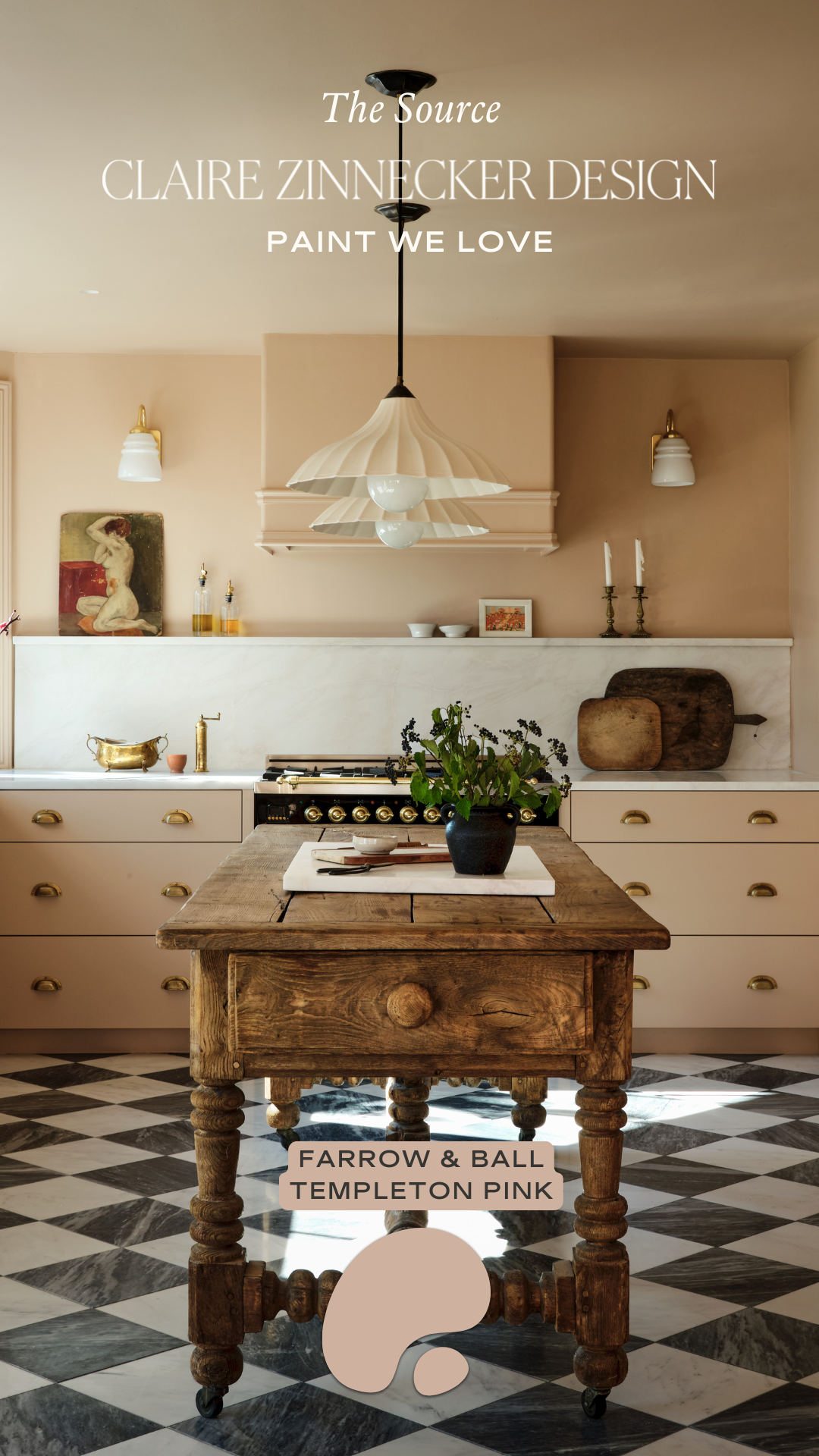
We’ve found that when you lean into a single color story, it creates an instant sense of calm and continuity. Whether you opt for a soft neutral or a daring pop of pigment, color drenching allows every element in a room to work in harmony, a design approach we’re continually drawn to. In our most recent CZD House Tour video (an exciting new series you can catch on our Instagram), we featured our North Austin Residence, a project that holds an extra special place in our hearts and was designed for a dear friend of Claire’s. For this home, we leaned into the color-drenching concept with a soft, muted pink (linked below!) that is quickly becoming one of our new neutrals. It is warm, timeless, and quietly unexpected, a shade that feels both fresh and familiar.
Paired with checkered marble floors and a full wall of panel-ready cabinetry, the space strikes the perfect balance between playful and refined. To elevate the look even further, we complemented the pink cabinets and walls with sleek brass hardware (check out our blog post talking all about mixing hardware styles), adding warmth, subtle contrast, and a touch of elegance. Beyond aesthetics, this choice also demonstrates the power of color theory: soft, muted hues like this pink evoke a sense of calm and warmth, making a space feel welcoming and cohesive. Choosing color allows you to lean fully into a palette, creating a mood and atmosphere that reflects the personality of the home and its owners.
If you’re thinking about trying color drenching in your own home, there are a few tips to keep in mind.
- Start by choosing a main color that resonates with the mood you want to create. Soft, muted hues can feel calming and welcoming, while brighter or more saturated tones add energy and playfulness.
- Next, think about texture and finish. Even when working with a single color, mixing materials like wood, marble, metals, and textiles can add depth and interest. Matte, satin, and glossy finishes all interact differently with light, giving your space subtle layers that keep it from feeling flat.
- Lighting is another key consideration. Natural light changes throughout the day and can shift the way a color feels, while artificial lighting adds warmth or coolness depending on the bulb. Testing swatches on multiple walls and in different lighting conditions can help you feel confident in your choice before committing fully.
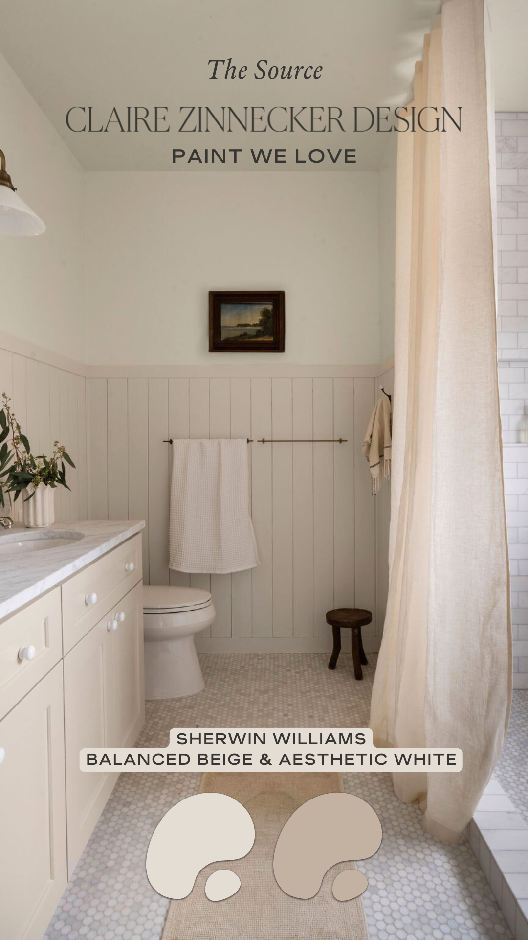
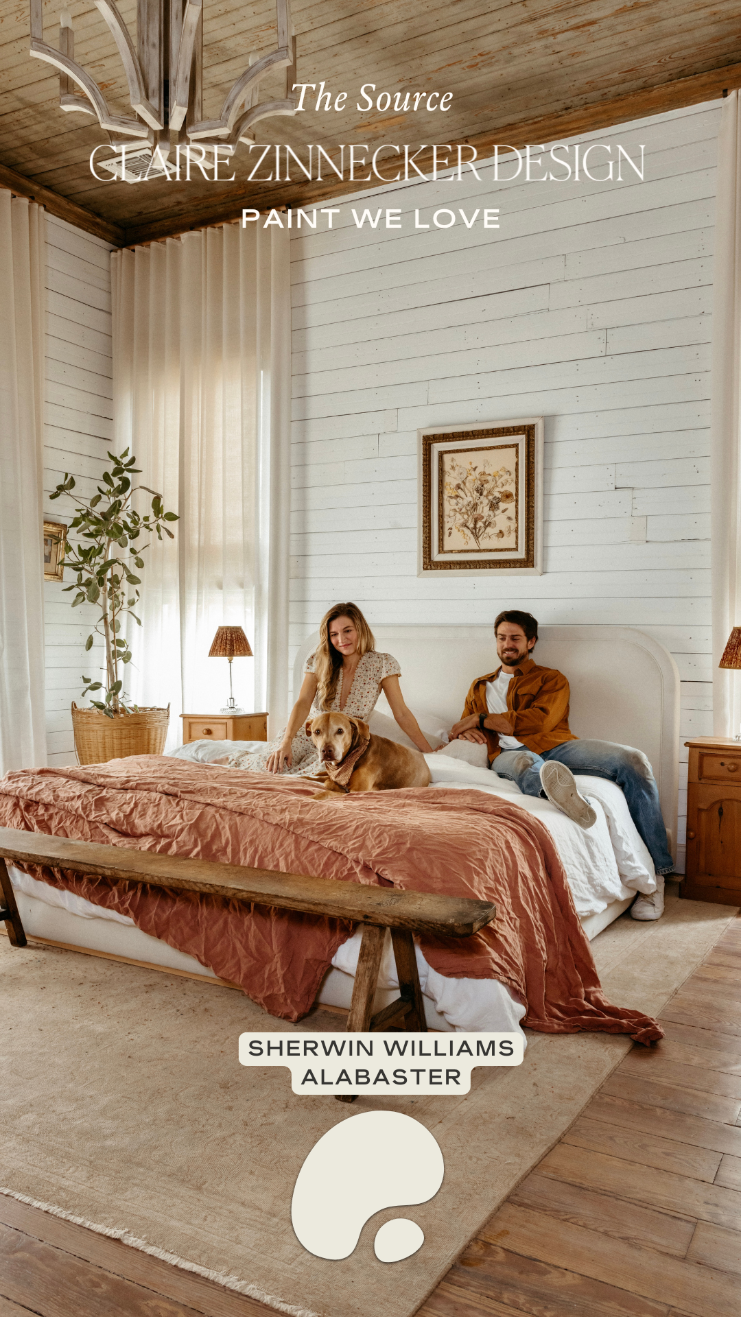
If a statement color isn’t in your palette - rest assured. There are a million different shades of white, so how do you choose? When deciding on a neutral paint color, I always start by sampling it directly in the space. Colors shift dramatically depending on the environment, so it’s important to see how they read in both natural and artificial light throughout the day.
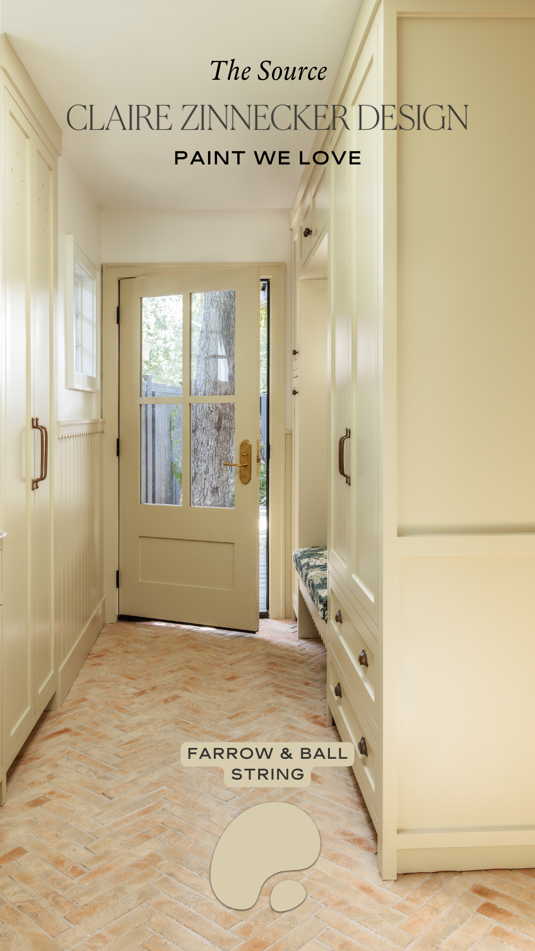
I also consider the desired tone of the room - whether the space should feel warm and inviting or cool and airy. Neutrals with blue or gray undertones tend to create a cooler, more modern feel, while those with soft yellow or beige undertones add warmth and depth. The right undertone can completely shape the mood, making it essential to look beyond the swatch and see how it truly lives in the space.
Finally, remember that color is a storytelling tool. By leaning into a single palette and layering thoughtfully, you can create a space that feels intentional, cohesive, and uniquely yours. Paint isn’t just about making a statement - it’s about shaping an atmosphere that reflects the personality of your home.
Thanks for joining us for this third installment of The Source. We hope you feel inspired to embrace color in new ways and experiment with shades that make your spaces feel joyful, personal, and full of life. Remember, the more intentional you are with color, the more a room can tell its own story.
If you have questions or want to chat about a project, feel free to reach out to Claire at info@clairenzinneckerdesign.com. And don’t forget to follow along for more inspiration on Instagram at @clairenzinneckerdesign. Until next time, happy designing!